A concept redesign that reimagines Instagram as a spatial experience, where users can view photos, floating stories, and interact using natural hand gestures in an immersive 3D environment.
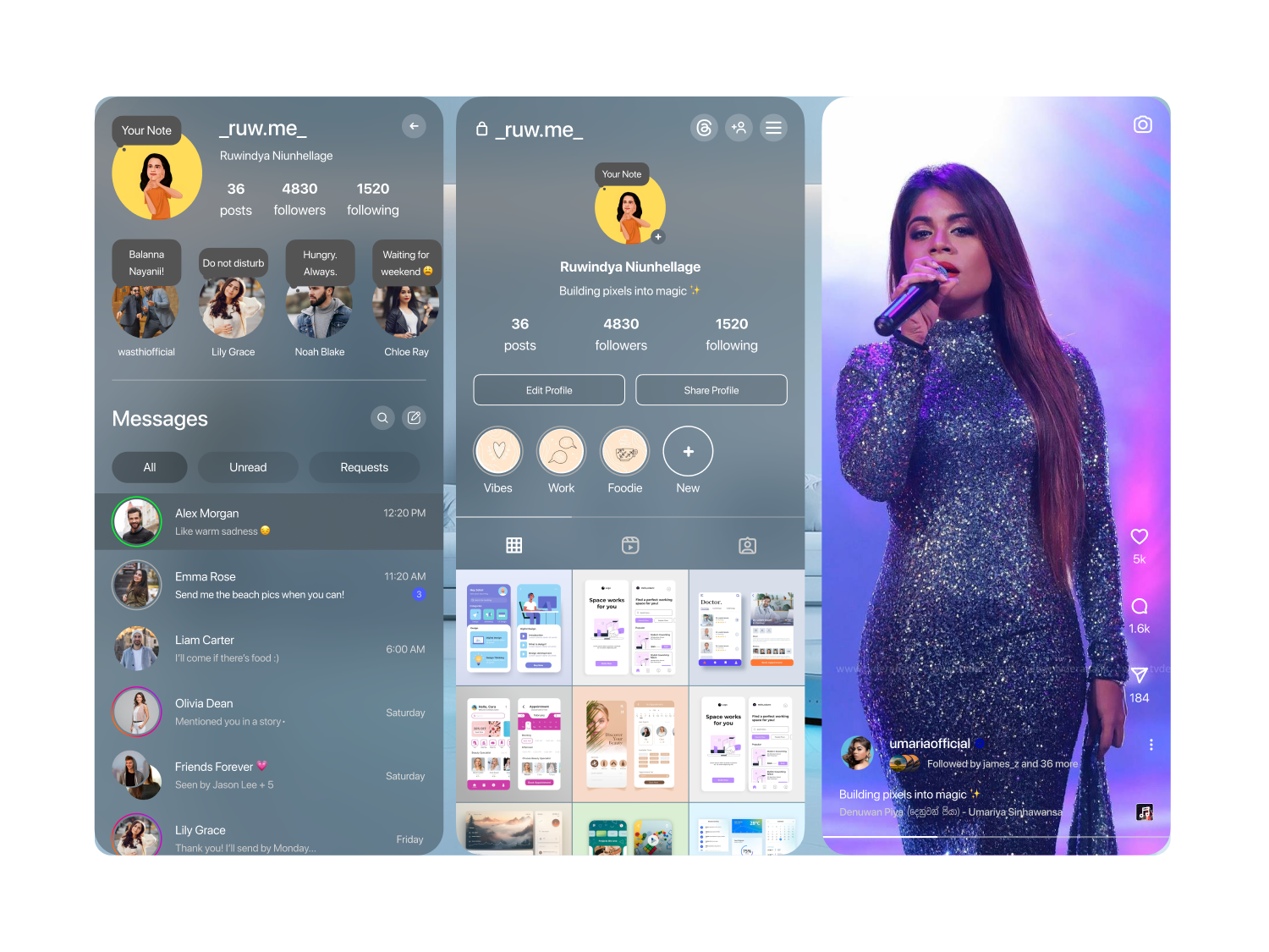
This concept reimagines Instagram as a spatial experience. Users can view photos, floating stories, and interact using natural hand gestures. The goal was to make Instagram feel more immersive and social, easier to use in an immersive environment, and more intuitive than dragging a flat phone interface into 3D space.
Tech-savvy Gen Z and Millennials, casual users, content creators, and influencers who want to browse content without holding a phone.
A spatial concept for Apple Vision Pro covering the home feed, story interactions, immersive full-screen scenes, profile views, and gesture-based navigation throughout.
I was the sole designer responsible for research, persona development, journey mapping, wireframing, and the final spatial UI showcase in Figma.
Most spatial computing apps today are just flat phone or desktop interfaces pinned to a window in 3D space. That misses the point of the medium entirely. Social browsing on Vision Pro should use gestures instead of touch, take advantage of depth and immersive scenes, and let stories feel like they exist in the room rather than being trapped inside a rectangle.
I built a target user persona, mapped a full journey across discovery, story viewing, and content creation, and sketched paper wireframes before moving into Figma. From there I designed a complete spatial UI showcase: notifications floating in space, gesture-based story interaction, immersive full-screen scenes, and a reimagined profile and explore page, all built around natural hand gestures instead of touch.
The visual direction leans on Instagram's signature gradient, orange through magenta into a deep blue-purple, applied as glowing accents against frosted glass panels that float in space. Light gray and icon-gray neutrals keep the UI calm so the gradient reads as intentional, not noisy, against immersive photo and video backgrounds.
Click any screen to view it full size.
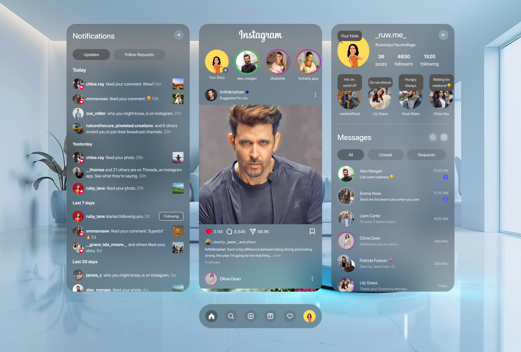
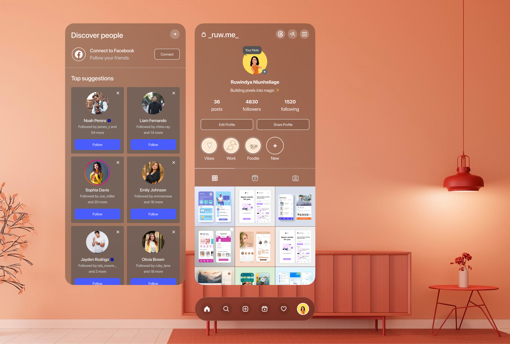
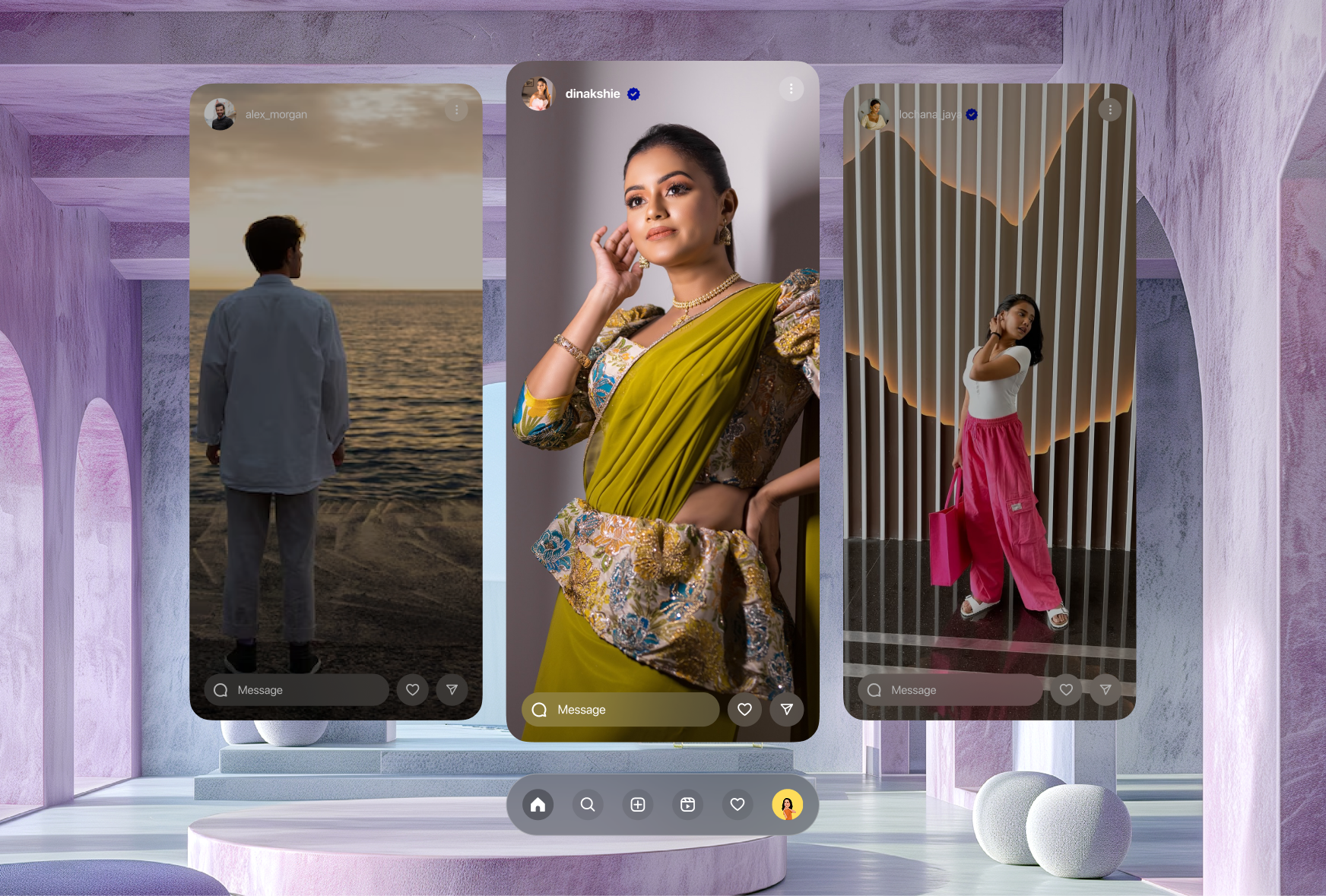
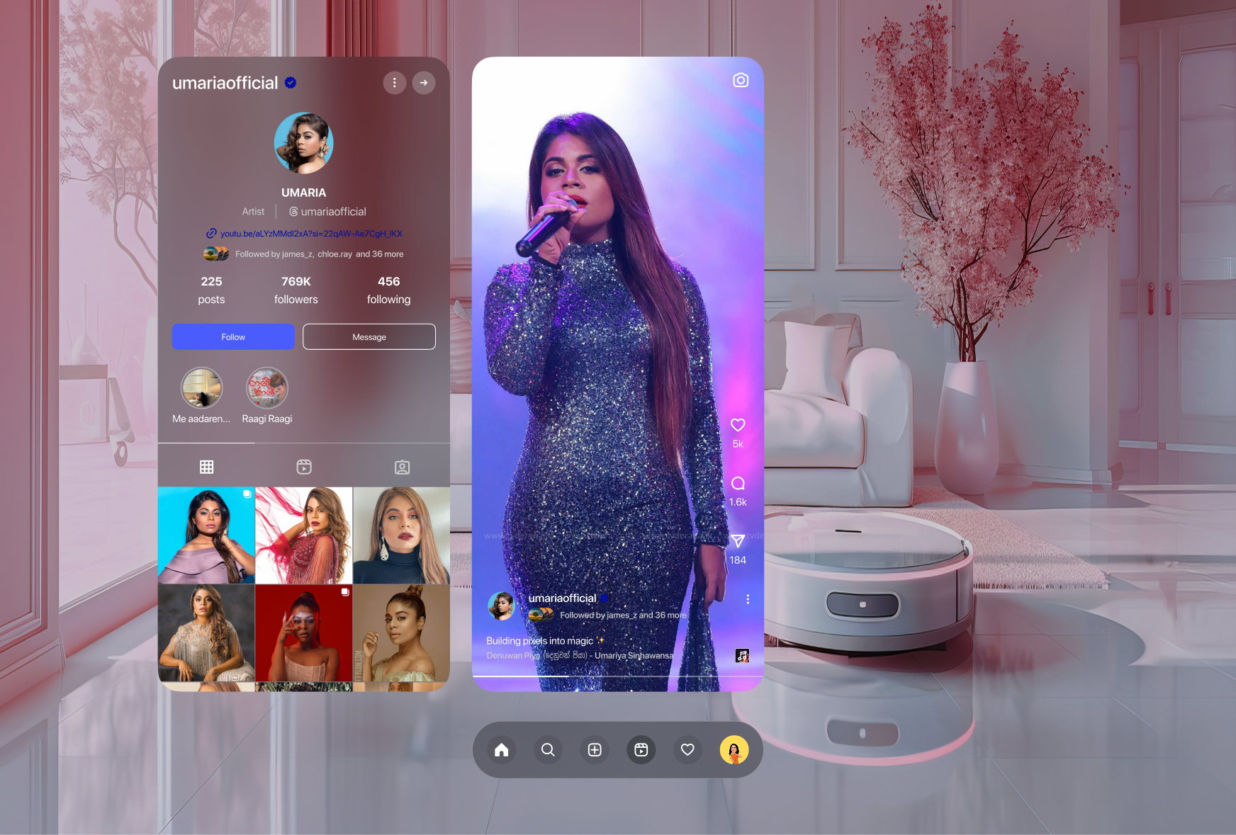
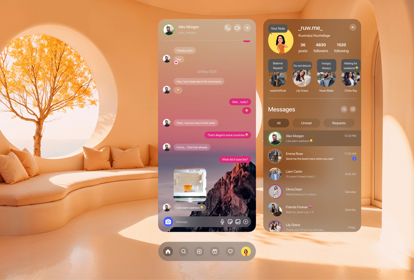
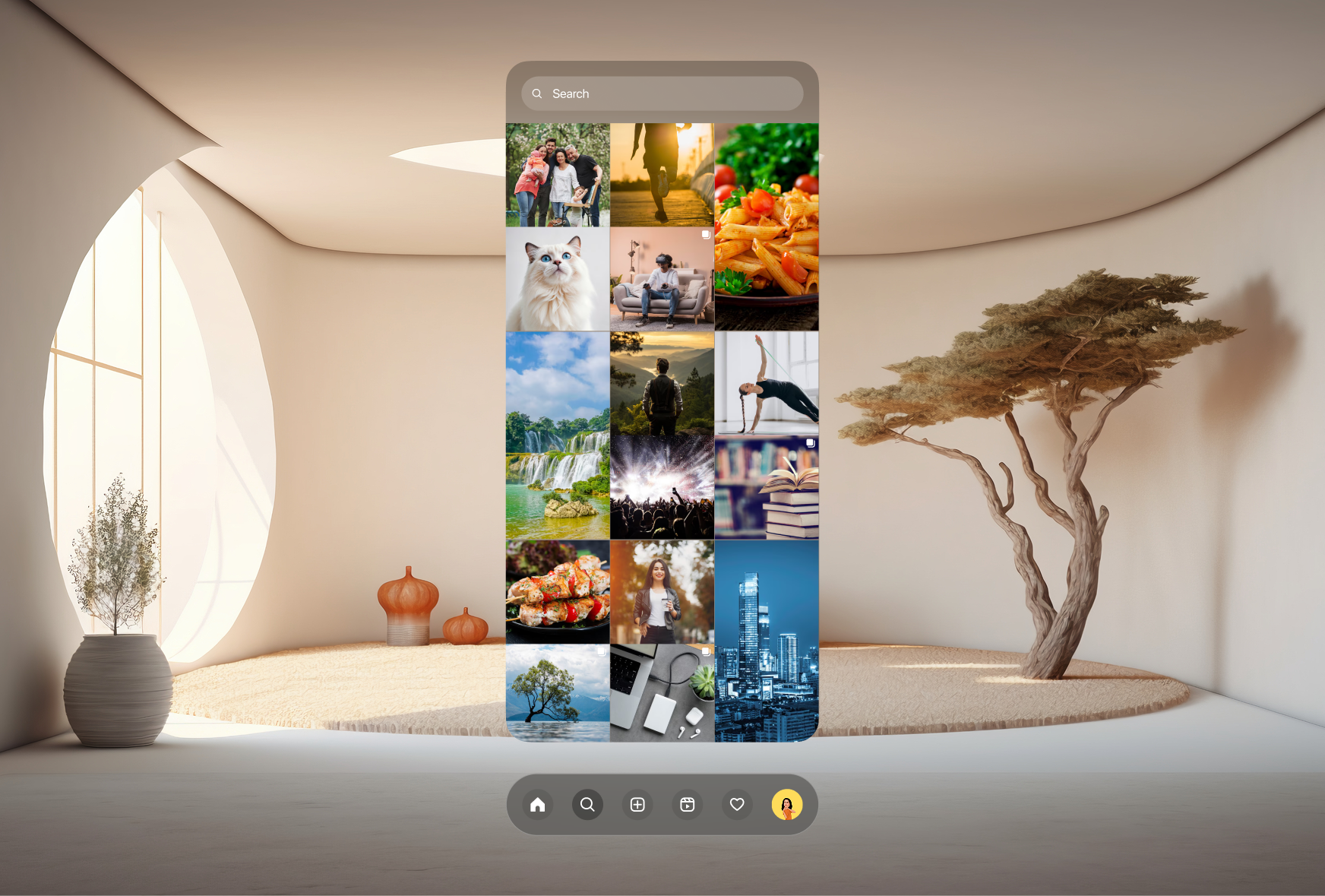
Designing for Vision Pro means designing for a body, not a screen. These are the calls that shaped how the final concept came together.
Touch targets do not exist in spatial computing. Every interaction in this concept is built around eye-gaze-to-focus and pinch-to-select, the native input language of Vision Pro, rather than porting over tap gestures from the phone app.
Flattening every element onto one plane wastes the one advantage spatial UI has over a phone screen. Notifications sit closer to the user, the main feed sits at a comfortable reading distance, and immersive scenes expand to fill the room when opened.
Opening a story does not pop up a window, it transforms the room around the user into the scene from the story, whether that is a beach, a street, or a living room. This makes the content feel like a place rather than a clip.
The signature orange-to-purple gradient is reserved for UI elements like buttons, rings, and notification glows, never overlaid on user photos or video. This keeps content the visual hero while still feeling unmistakably Instagram.
Designing for spatial computing throws out a lot of assumptions that hold true for flat screens. Depth, gaze, and gesture all become design materials in their own right, and a familiar app like Instagram becomes a useful lens for figuring out how far that reinvention should go before it stops feeling familiar at all.
Portfolio
Selected works that showcase my craft across design and development.
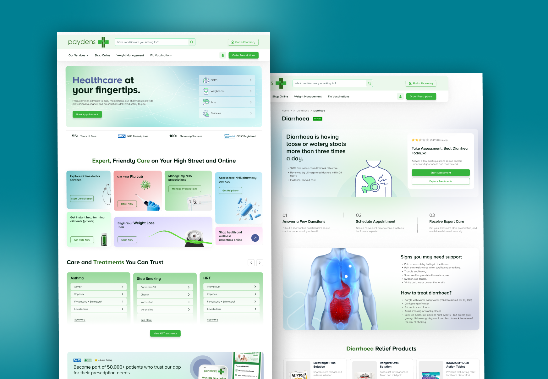

Whether you need a full product from scratch, a design refresh, or a landing page that converts, I bring pixel-perfect craft and strategic thinking to every project.
Email Me