A full website redesign for a UK pharmacy group, trusted since 1969. Makes it easier for patients to find NHS services, order prescriptions, and get expert pharmacy care without the usual high-street hassle.
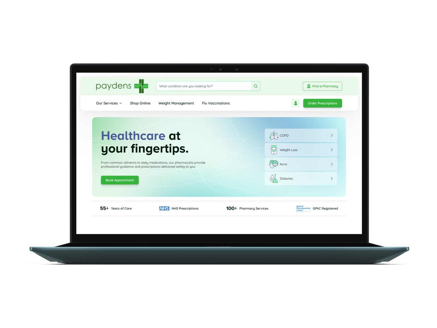
Paydens is a family-run UK pharmacy group operating over 100 branches across the South-East of England since 1969. The project was a full website redesign, covering everything from the homepage and NHS service finder through to condition pages, the online shop, account management, and the regulatory footer content required across the pharmacy sector.
Patients across the South-East of England who want fast access to NHS services, private consultations, repeat prescriptions, and pharmacy products without an unnecessary GP visit.
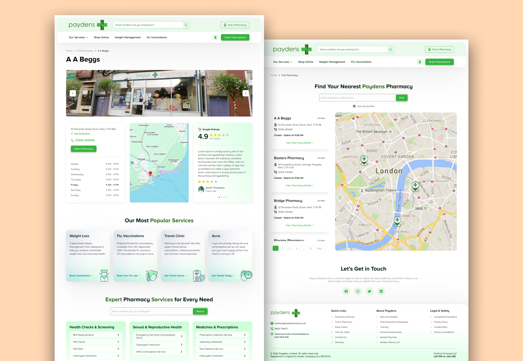
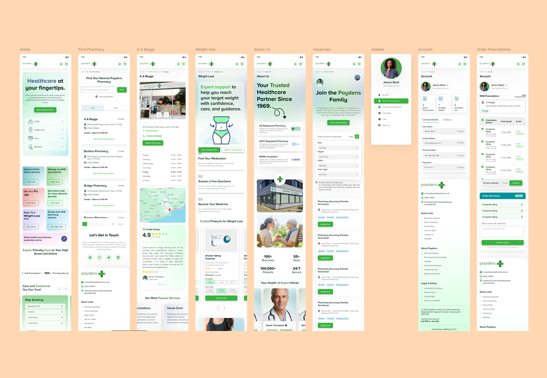
A fully responsive website covering the homepage, pharmacy finder, condition and treatment pages, an online shop, account and prescription management, and a compliant GPhC-aligned footer.
I was the sole designer responsible for research, information architecture, wireframes, visual design, and a handoff-ready Figma prototype with a basic component library.
With over 100 branches and a wide mix of NHS, private, and retail services, the existing Paydens site struggled to make it clear where a patient should start. Finding a nearby branch, checking NHS eligibility, and ordering a repeat prescription all felt like separate, disconnected journeys. First-time visitors often left without booking anything simply because the path from "I have a sore throat" to "I've been seen" was not obvious.
I ran competitor research across UK pharmacy and NHS service providers, mapped out the full information architecture for the condition-led assessment flow, built wireframes in FigJam, and took the design all the way through to a pixel-perfect Figma prototype ready for developer handoff. I also put together a basic component library so the engineering team had a consistent set of building blocks from day one.
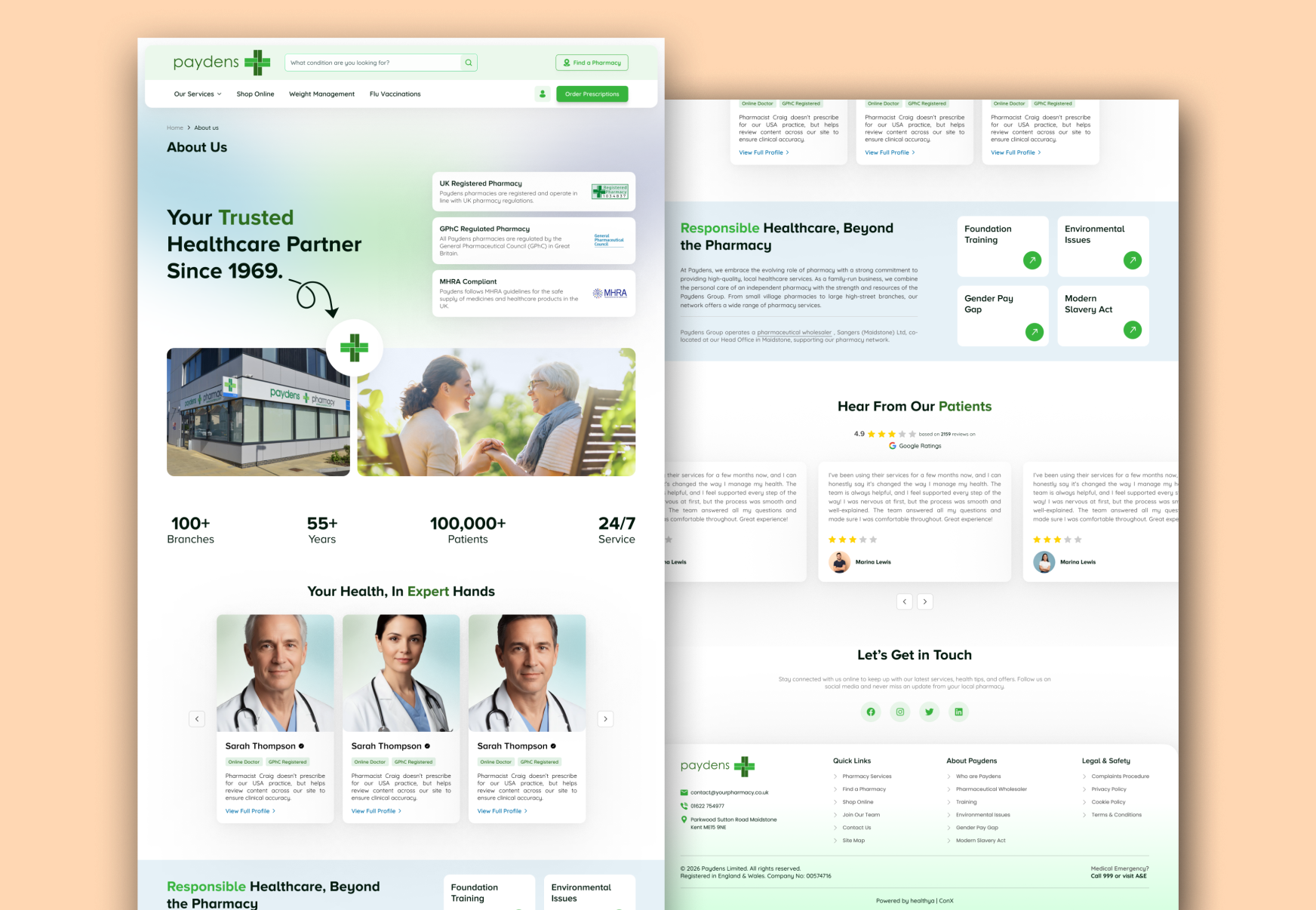
The visual direction leans on Paydens' signature green, paired with a cool blue secondary palette that gives the brand medical credibility without losing warmth. Generous white space and a clear typographic hierarchy keep dense NHS service information easy to scan, even on mobile.
Click any screen to view it full size.
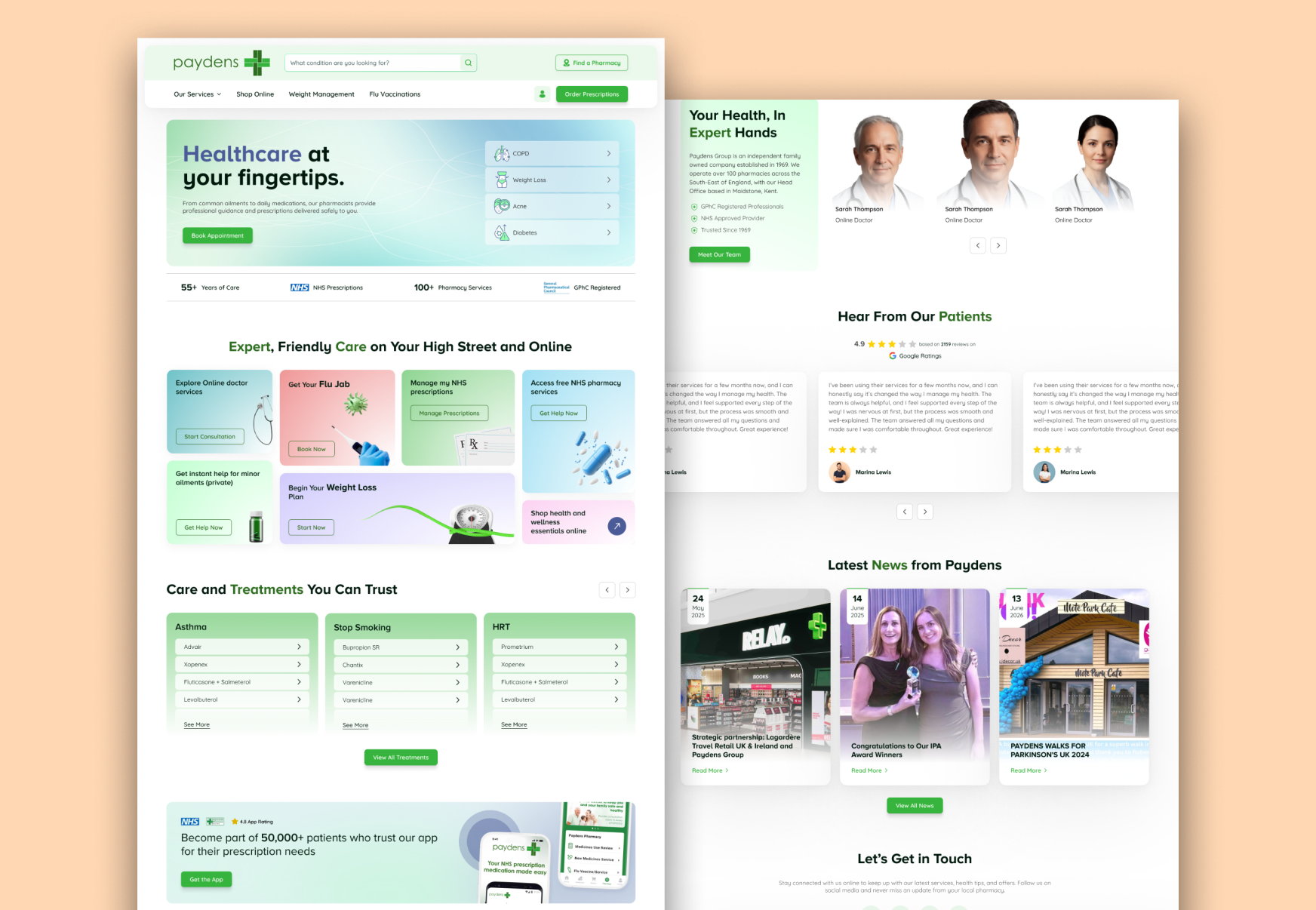
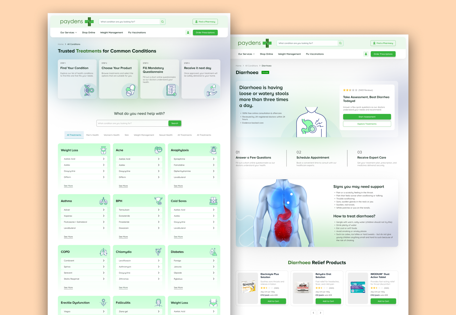
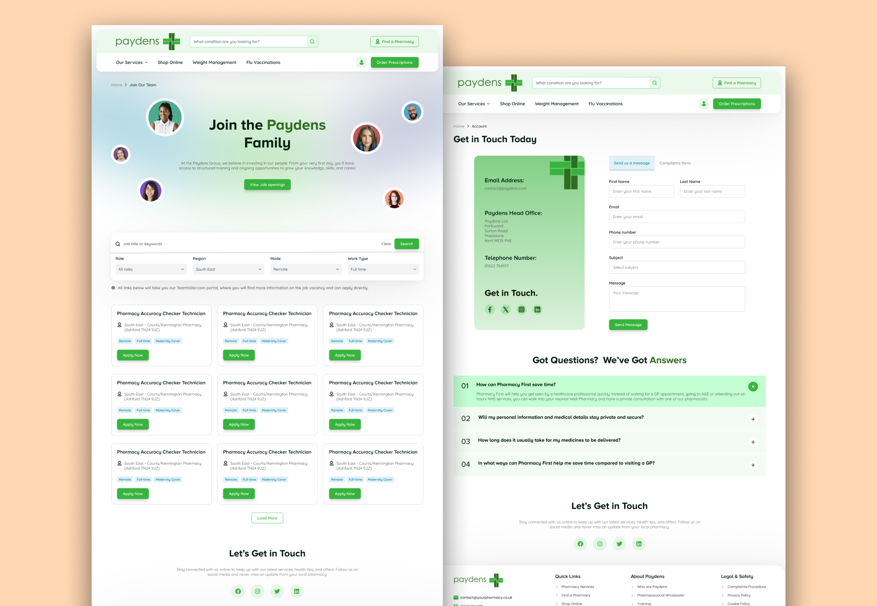
A pharmacy group operating both NHS and private services has a lot of competing priorities. Trust, speed, regulatory compliance, and ease of booking. These are the calls that shaped how the final design came together.
Patients searching for help think in symptoms, not departments. A single "What condition are you looking for?" search bar in the header replaces a maze of NHS Services, Private Services, and Health and Wellness menus, cutting time-to-booking significantly during testing.
Trust signals like the GPhC registration, "55+ Years of Care," and NHS Approved Provider badges sit near the top of key pages rather than buried in the footer. Patients who saw these details early moved through the assessment flow with noticeably fewer drop-offs.
Booking an NHS Pharmacy First consultation involves location, patient details, a clinical self-assessment, and scheduling. Breaking this into four clearly labelled steps, with progress always visible, made a process that could feel intimidating feel manageable instead.
A meaningful portion of pharmacy customers are 50 and above. Every text element meets WCAG 2.1 AA contrast ratios, body text sits at 16px minimum, and tap targets on mobile are never smaller than 44px. Accessible design here is not optional, it is the product.
Designing for a pharmacy group that bridges NHS and private healthcare is a balancing act. The stakes are higher, the regulations are tighter, and the range of services (from flu jabs to weight management to repeat prescriptions) is wider than most digital products need to account for. Here is what working in this space taught me.
Portfolio
Selected works that showcase my craft across design and development.
Whether you need a full product from scratch, a design refresh, or a landing page that converts, I bring pixel-perfect craft and strategic thinking to every project.
Email Me