A full UX/UI design for a mobile fashion shopping app — making browsing, filtering, and buying clothes simpler, faster, and more enjoyable for everyday shoppers.
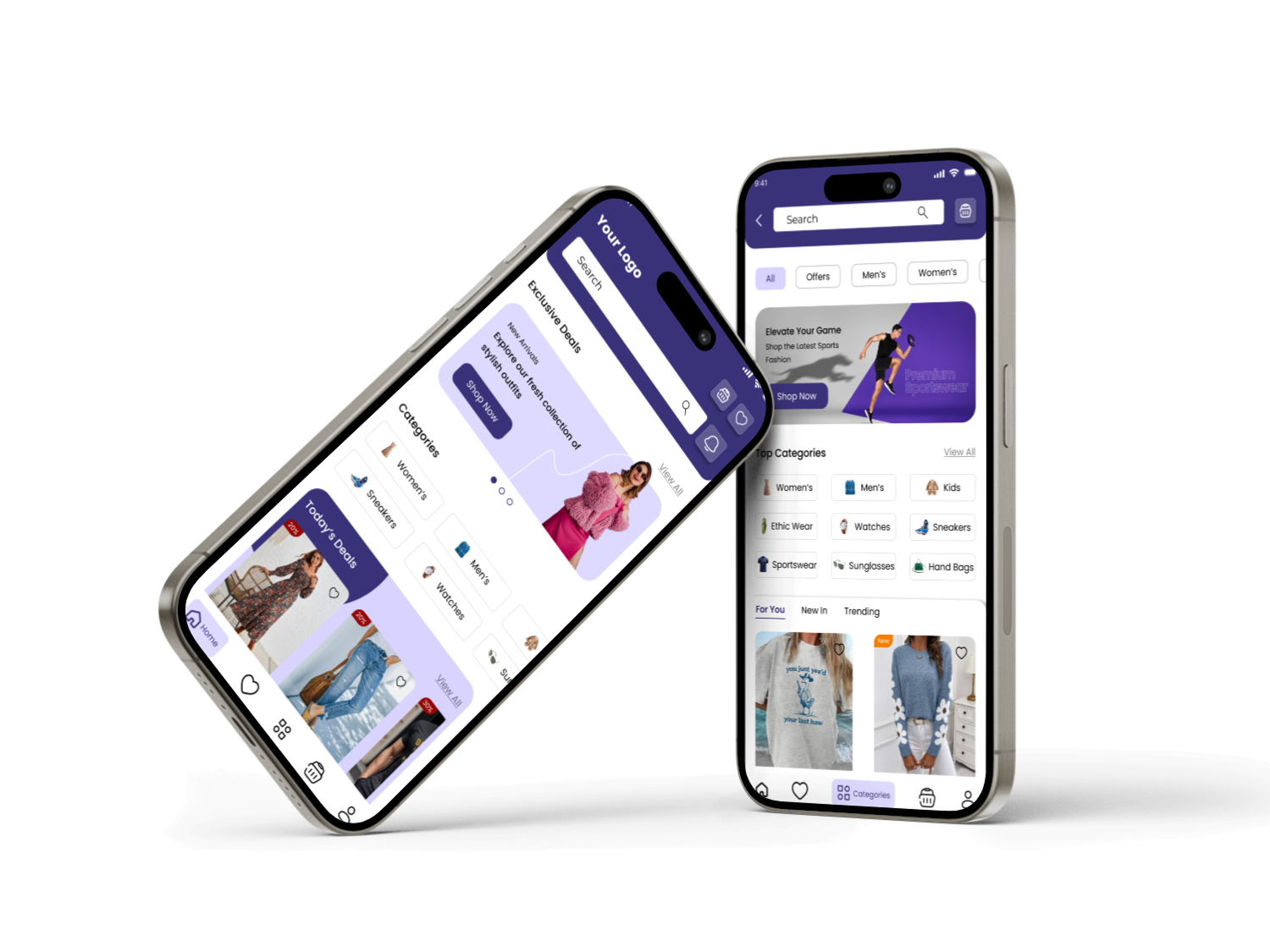
This project was a concept design for a mobile fashion shopping app — rethinking the entire shopping experience from the home screen through to category browsing, product details, and filtering. The goal was a clean, modern interface that felt fast and stylish, reflecting the brand's position as a go-to destination for everyday and trend-led fashion.
Style-conscious shoppers aged 18 and above who want to discover and buy clothing across men's, women's, and kids' categories quickly through their phone.
A native mobile app design covering the home screen, category browsing, filtering, single product page, and key UI components used throughout.
Sole designer from research through to high-fidelity prototype — user research, information architecture, wireframes, visual design, and a component library in Figma.
Existing fashion shopping apps often feel cluttered and visually inconsistent. Navigation relied on deeply nested category menus, filtering products by size, color, or pattern was slow and unintuitive, and product pages lacked the visual detail shoppers need to feel confident before buying. Users who tried browsing for the first time often gave up before adding anything to their cart simply because the experience felt more frustrating than browsing in store.
I followed a structured five-phase design process: studying user needs and existing pain points, mapping information architecture, creating wireframes, building the high-fidelity UI, and then refining based on feedback before preparing for developer handoff.
The visual direction is fresh and approachable — rooted in a confident purple, elevated with generous white space, clear typographic hierarchy, and a bold promotional language that makes deals and new arrivals immediately obvious. The result feels modern and stylish without being overwhelming.
Click any screen to view it full size.
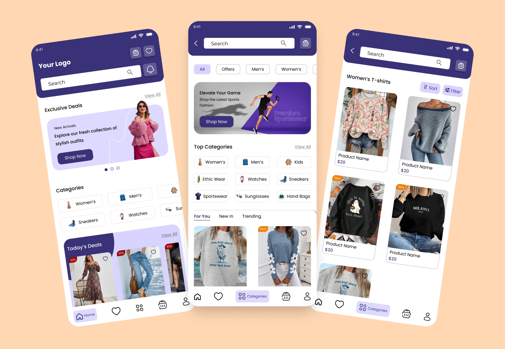
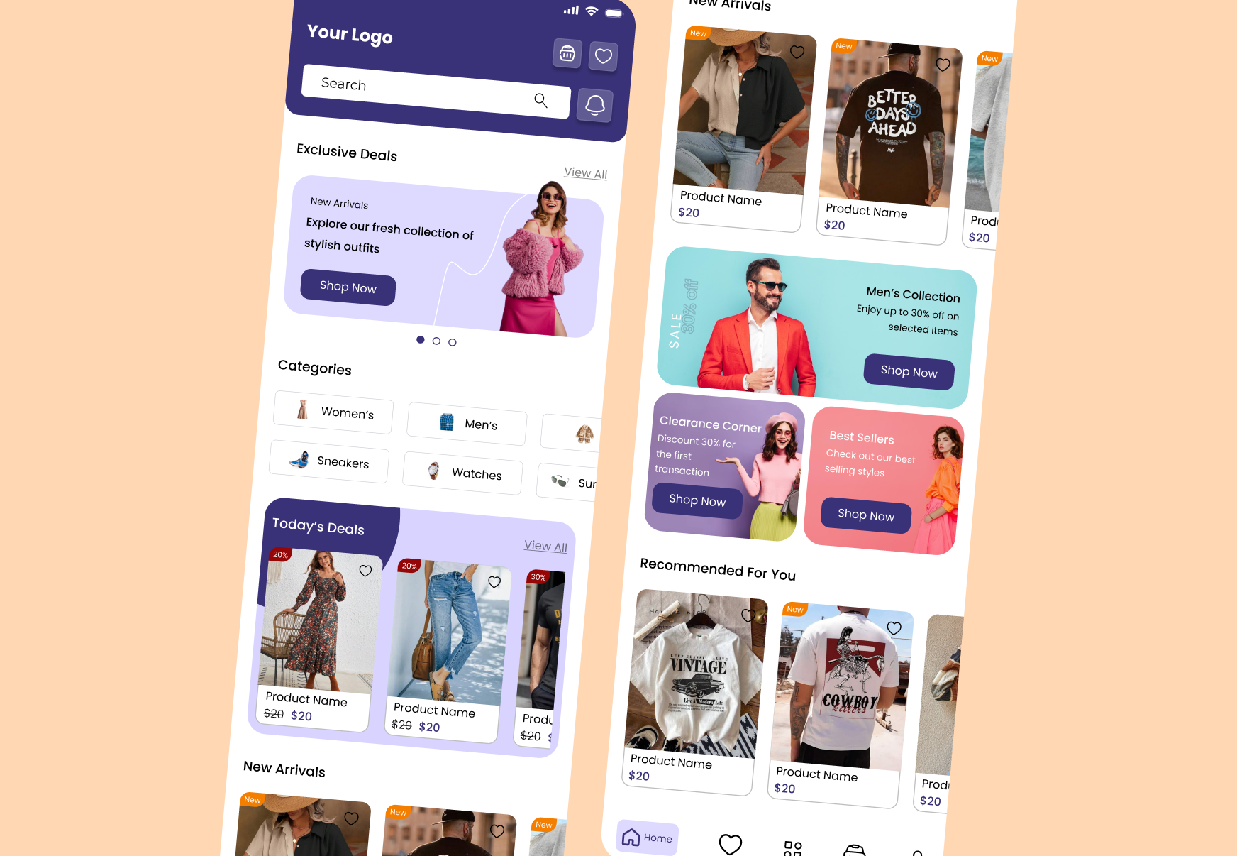
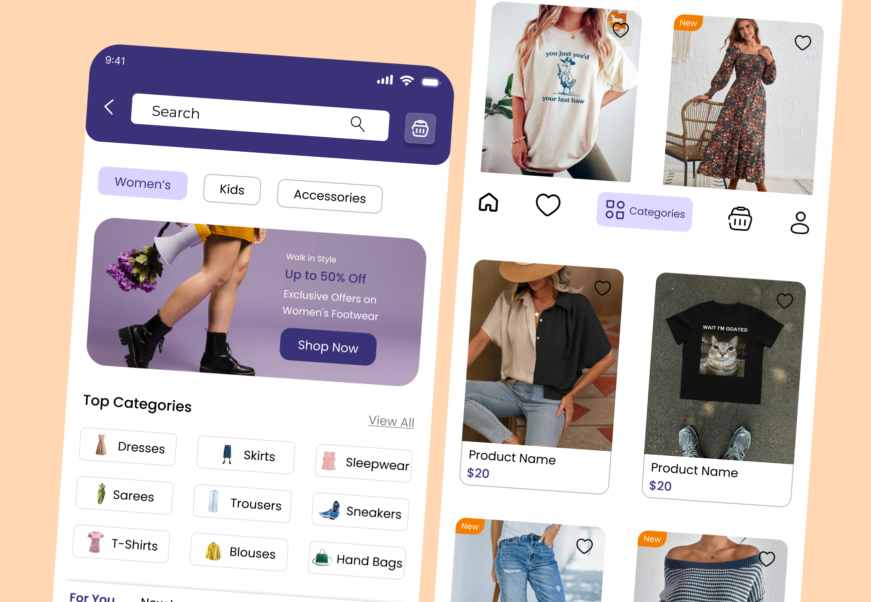
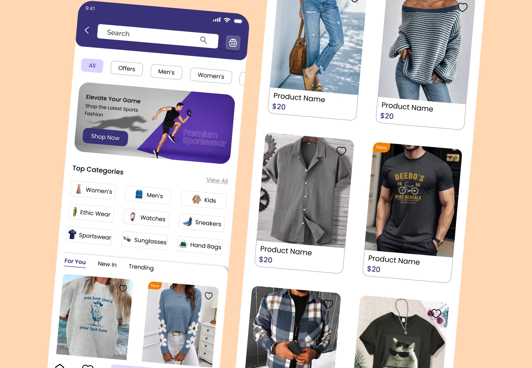
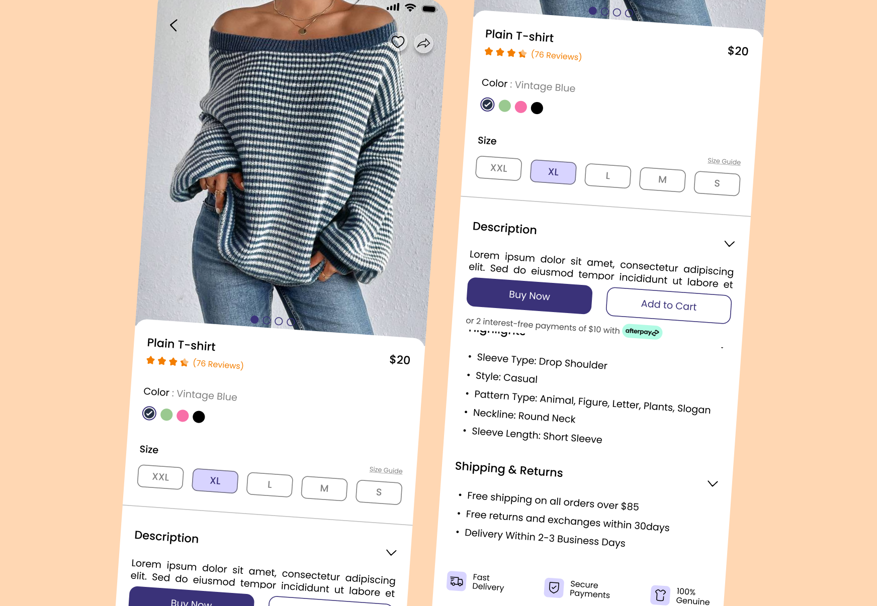
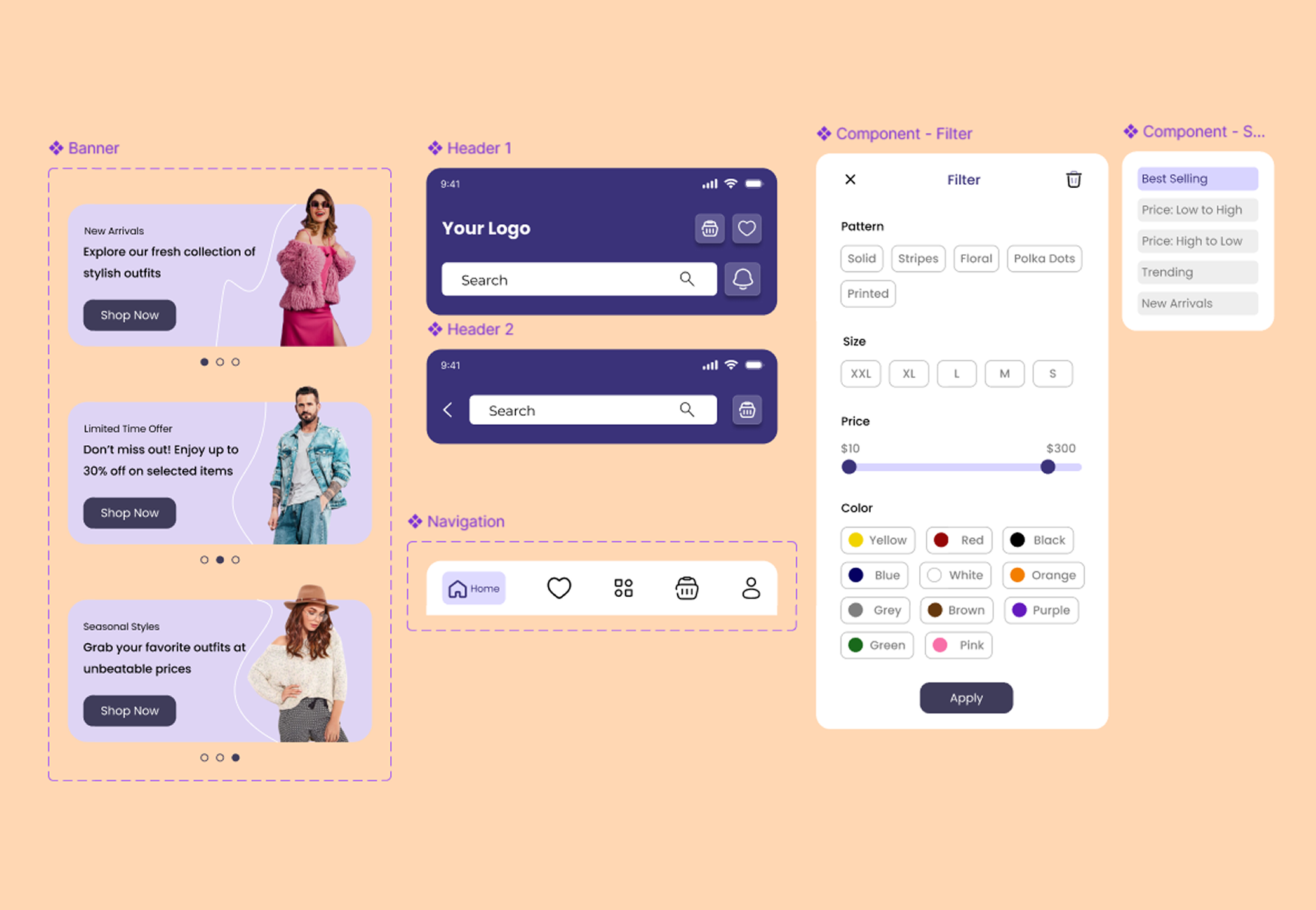
Fashion apps sit at the crossroads of speed, style, and choice. Every decision was made to remove friction from the path between landing on the home screen and completing a purchase.
The original concept buried categories two or three levels deep. The redesign surfaces top categories like Women's, Men's, and Kids as a persistent horizontal chip strip on the home screen, cutting the average taps to find a product from four down to two in early testing.
Price and seasonal relevance are primary reasons shoppers choose one fashion app over another. Leading with bold promotional banners on the home screen creates an immediate sense of value before the user has browsed a single category.
Combining pattern, size, color, and price into one bottom-sheet filter component reduces the number of screens a shopper has to navigate through to narrow down results, making discovery feel quick rather than tedious.
Every product card shows the product name and price in a clear hierarchy, with consistent imagery sizing across the grid so shoppers can scan and compare items at a glance, without hunting for details.
Designing a fashion shopping app means balancing visual appeal with usability — shoppers want to feel inspired by the imagery, but they also need fast, frictionless ways to filter, compare, and buy. Getting the component system right early made it much easier to keep every screen consistent as the scope grew.
Portfolio
Selected works that showcase my craft across design and development.
Whether you need a full product from scratch, a design refresh, or a landing page that converts — I bring pixel-perfect craft and strategic thinking to every project.
Email Me