A full landing page design for a skincare brand. Makes it easier for customers to find the right products for their skin needs, build trust in the brand, and convert from browsing to buying in a single visit.
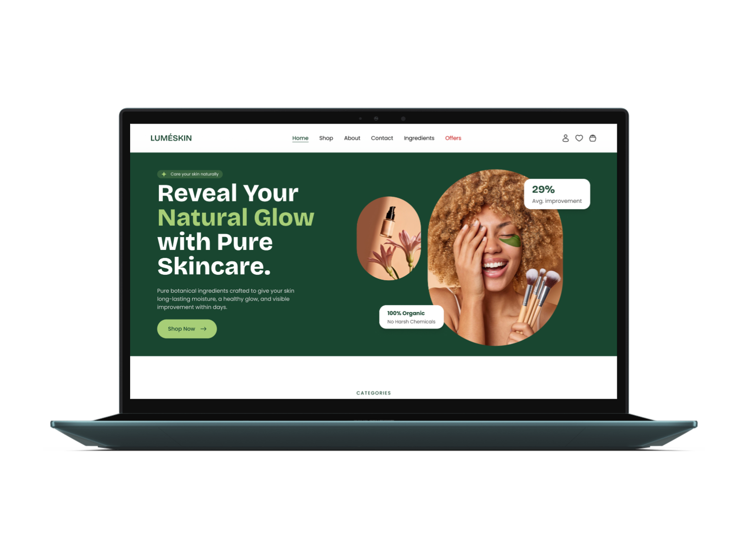
LumeSkin is a skincare brand built around clean, plant-based formulas. The project was a full landing page design, everything from the hero and skin-need category browsing through to product highlights, a brand story section, customer testimonials, and a newsletter signup footer.
Skincare shoppers who want a quick way to find products suited to their specific skin concern, from dryness to acne, without wading through a generic catalogue.
A fully responsive single landing page covering the hero, skin-need categories, top picks, brand story, testimonials, and a newsletter capture footer.
I was the sole designer responsible for research, layout, visual design, and a handoff-ready Figma prototype with a basic component library.
Most skincare landing pages either lean too heavily on lifestyle imagery with very little product information, or pack the page with so many products that shoppers cannot tell what is actually suited to their skin. First-time visitors often left without exploring a single product simply because nothing on the page helped them figure out where to start.
I ran competitor research across a handful of skincare and beauty brands, mapped out the page structure, and took the design all the way through to a pixel-perfect Figma prototype ready for developer handoff. I also put together a basic component library so the engineering team had a consistent set of building blocks from day one.
The visual direction is earthy and premium without feeling clinical. A deep forest green primary colour paired with a soft sage accent gives the brand a natural, plant-based credibility, while generous white space and clear typographic hierarchy keep the page easy to scan quickly.
Click any screen to view it full size.
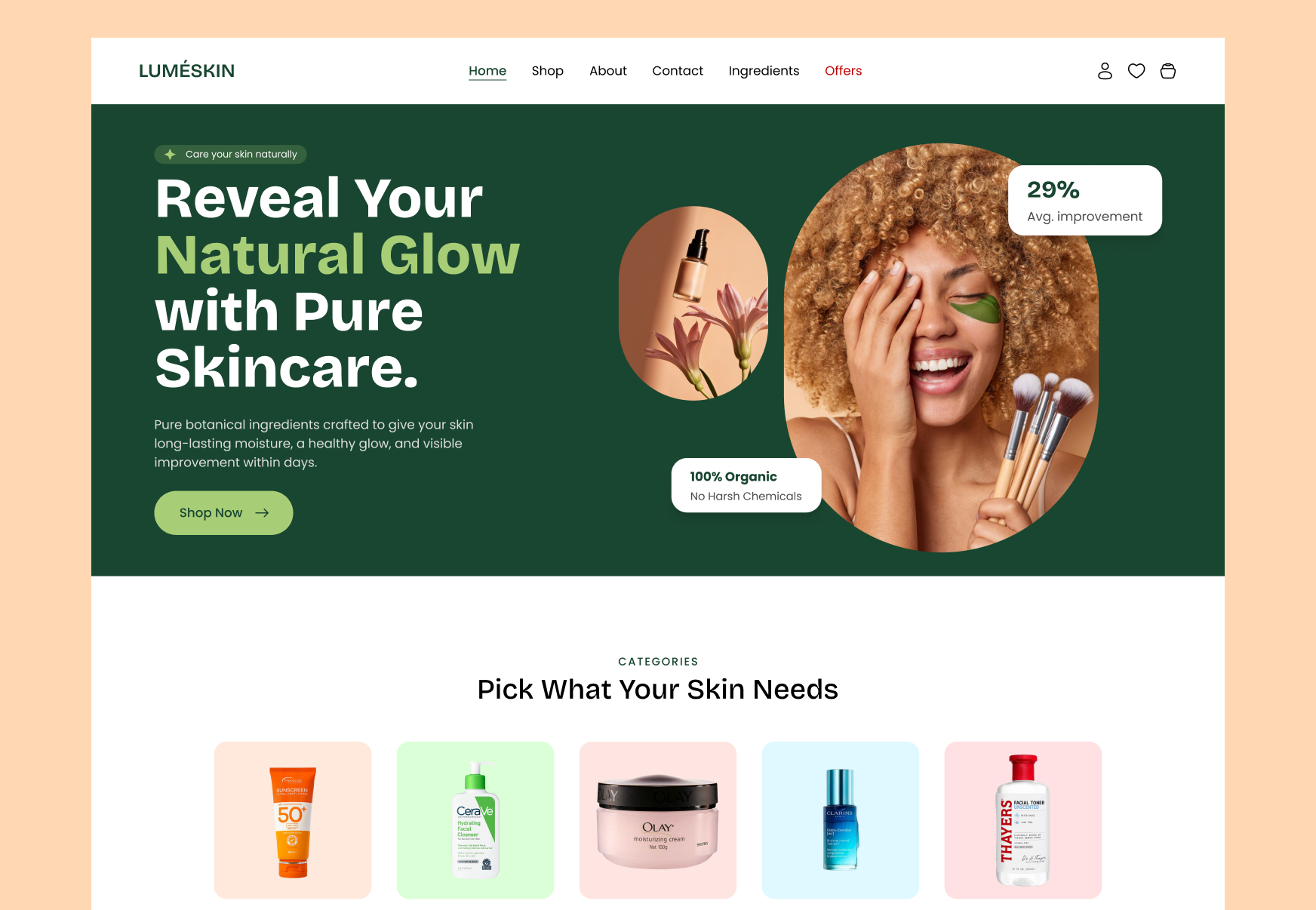
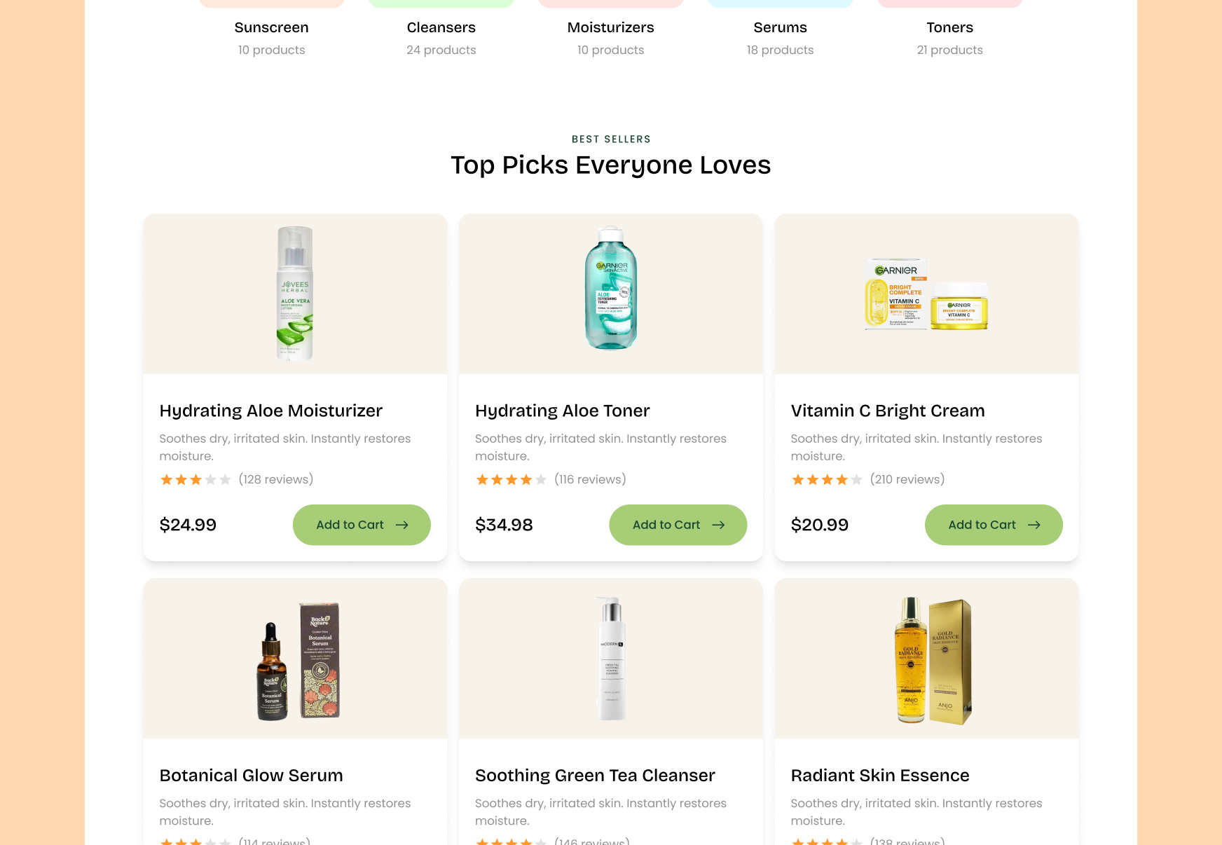
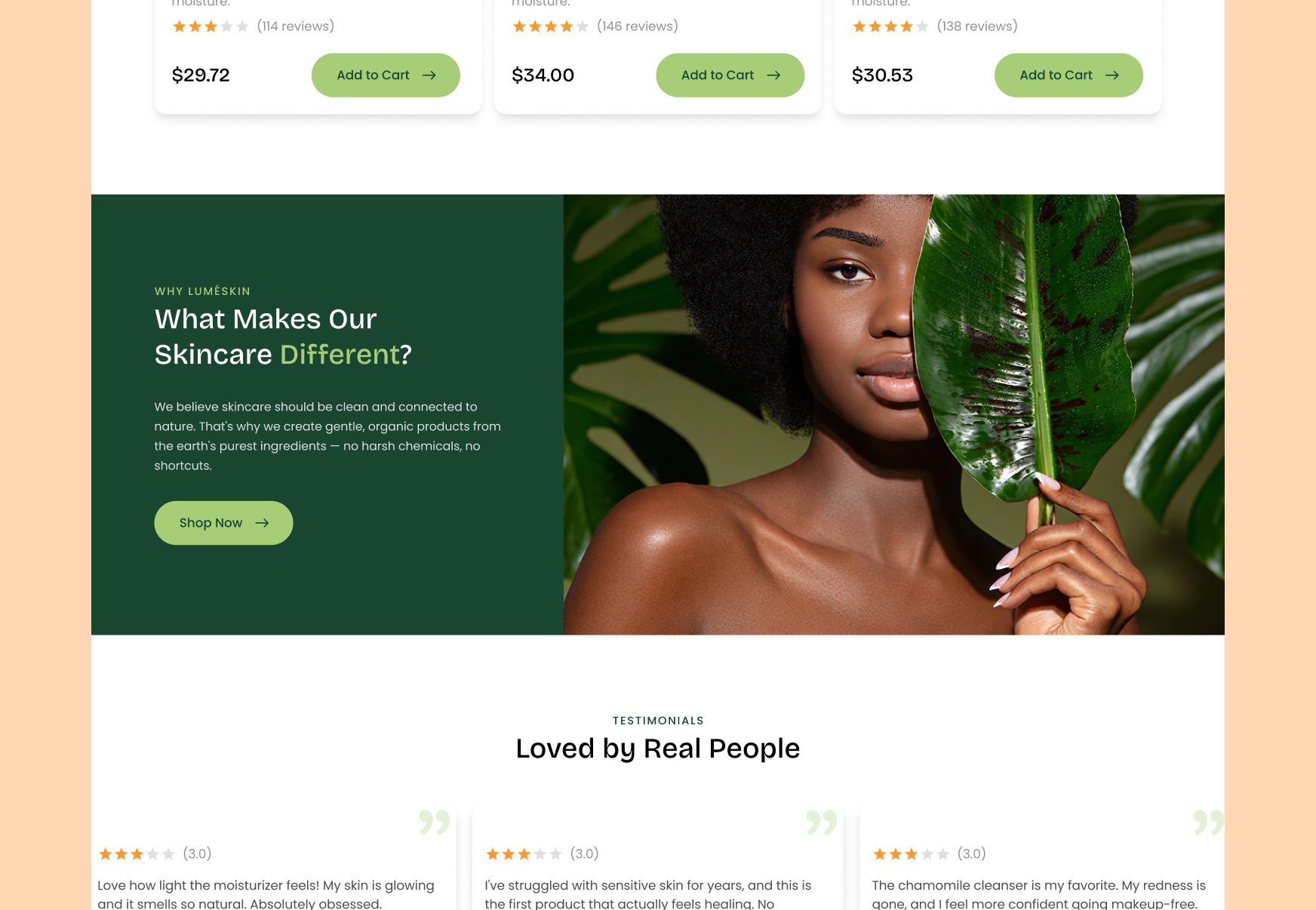
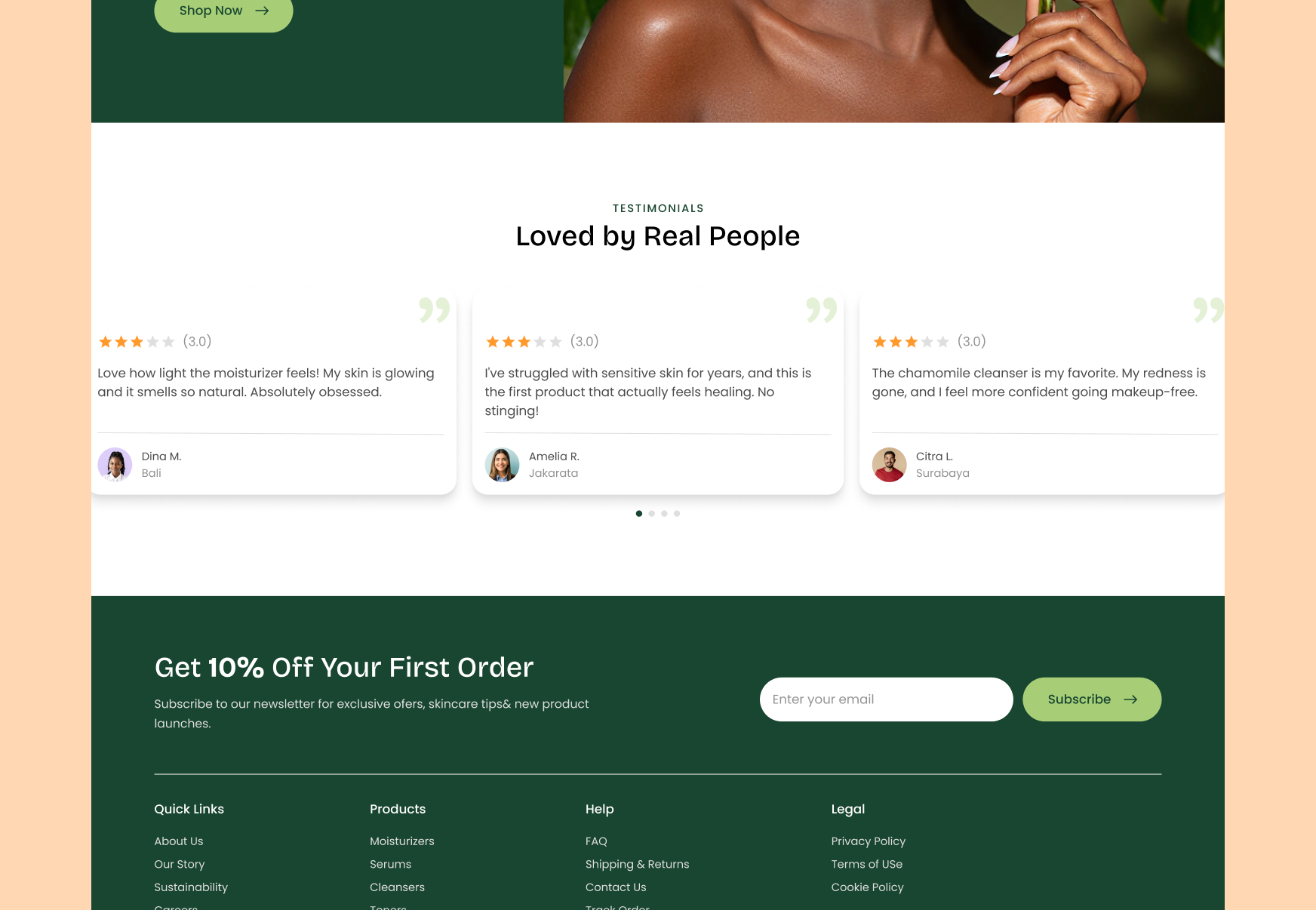
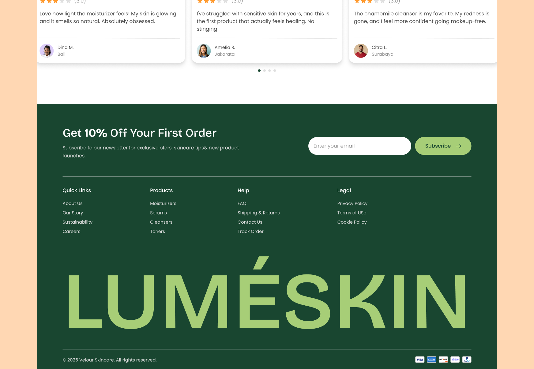
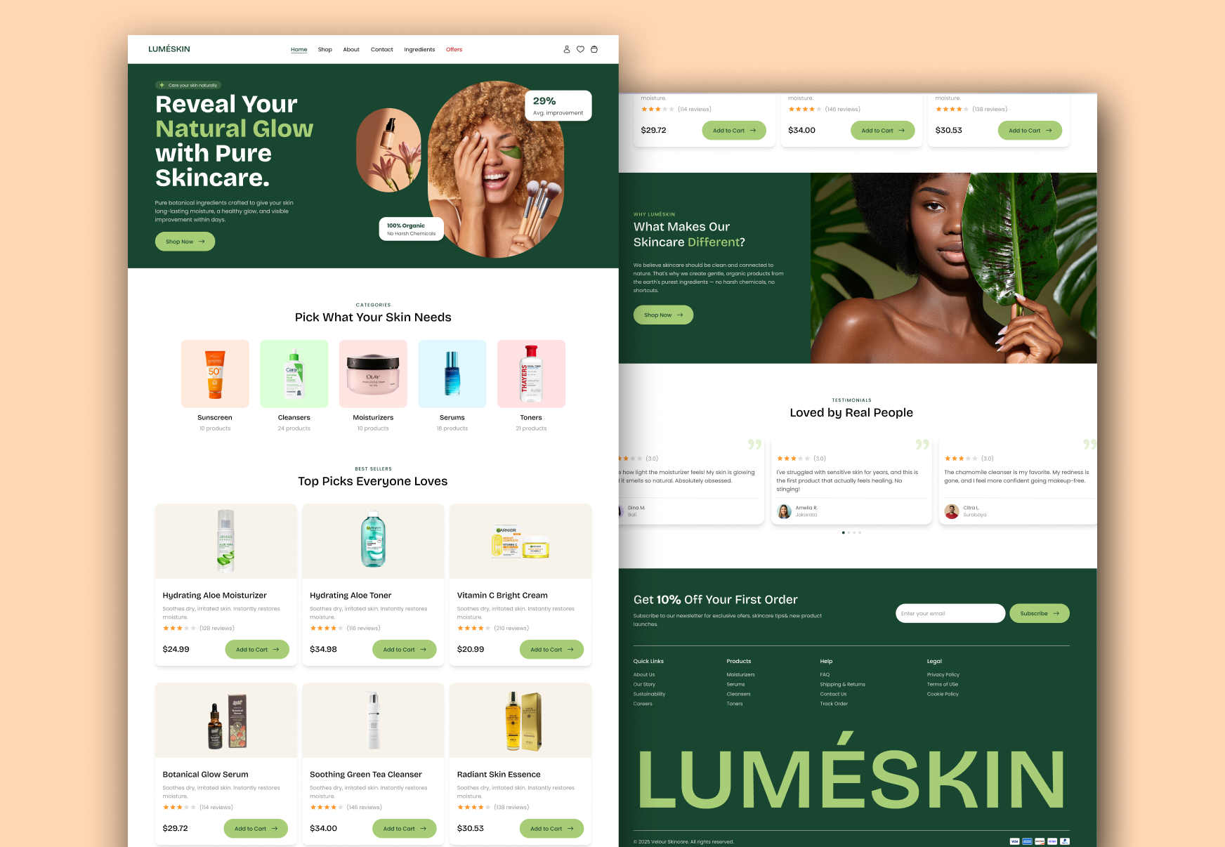
A skincare landing page has to balance brand storytelling with the practical job of helping someone pick the right product. These are the calls that shaped how the final design came together.
Shoppers think in concerns, not categories. A row of simple skin-need icons, Sunscreen, Cleanser, Moisturizer, Serum, and Toner, lets a visitor jump straight to relevant products instead of browsing an undifferentiated grid.
Social proof at the point of decision matters more than a brand statement above the fold. Showing a star rating directly on each product card in the Top Picks grid gave shoppers a fast, low-effort signal of quality before they clicked through.
Leading with a visible discount badge next to the hero imagery creates an immediate sense of value before a visitor has scrolled past the first screen, which matters most for cold traffic arriving from ads or social.
Skincare purchases are emotional as much as functional. A full-width section pairing a real model photo with a short "What Makes Our Skincare Different" statement gives the brand room to build trust before asking for the sale.
A single-page commerce site has to do more work per screen than a multi-page site. Every section needs to either build trust or move the visitor closer to a purchase, with no room for filler. Working within that constraint sharpened how I think about page hierarchy and pacing.
Portfolio
Selected works that showcase my craft across design and development.
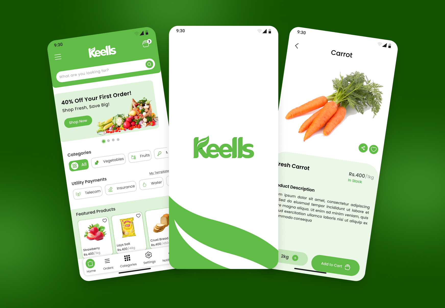
Whether you need a full product from scratch, a design refresh, or a landing page that converts, I bring pixel-perfect craft and strategic thinking to every project.
Email Me