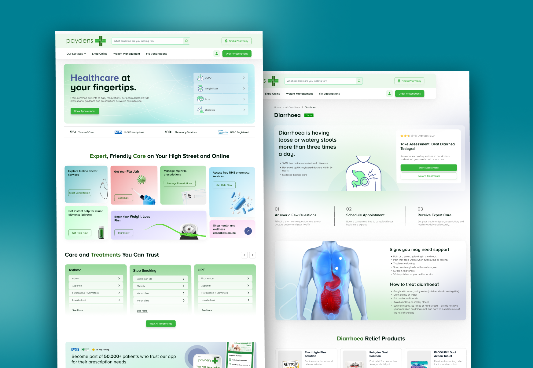
A full website design for a UK-based online pharmacy. Makes it easier for patients to find treatments, understand their options, and get medications delivered to their door without the usual NHS wait times.
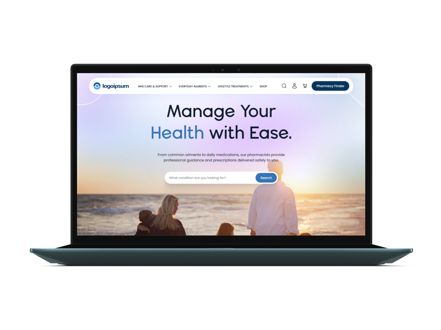
This is a UK-based online pharmacy platform where patients can consult with registered pharmacists, get prescriptions for common conditions, and have medications delivered to their home. The project was a full website design, everything from the homepage structure and navigation through to product pages, service sections, and the regulatory footer content required by the GPhC.
UK patients aged 18 and over who want quick access to prescription treatments, travel vaccines, and weight management support without booking a GP appointment.
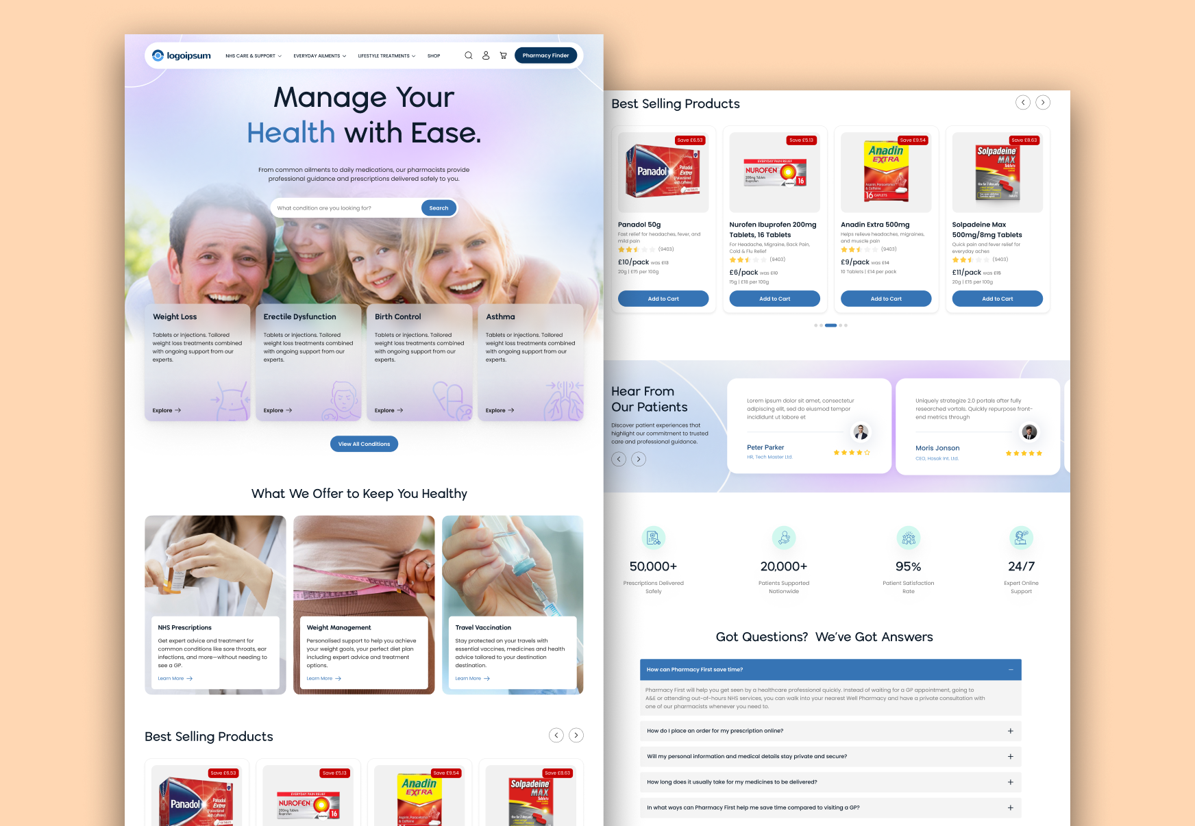
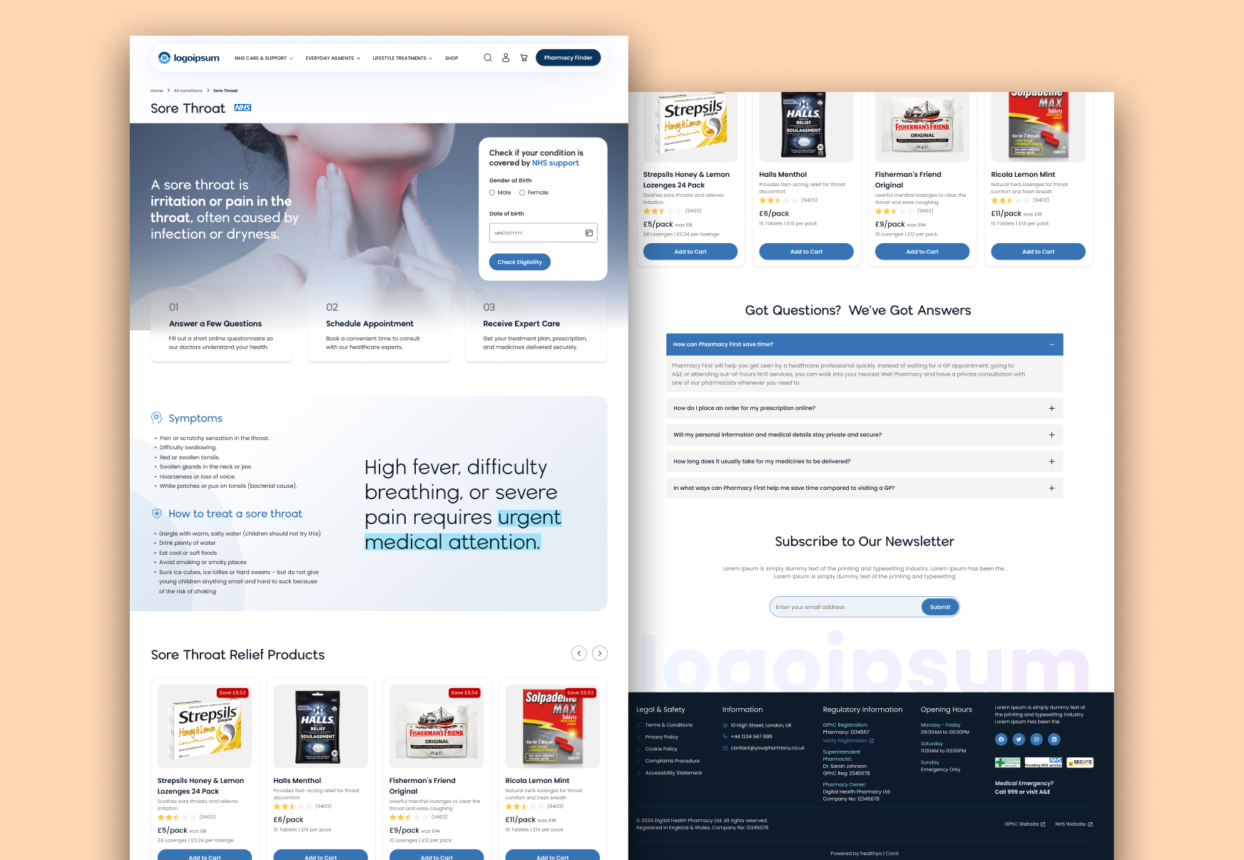
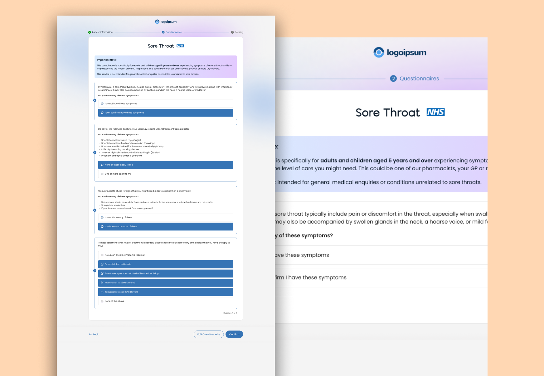
A fully responsive website covering the homepage, condition listing pages, service overviews, a product shop section, and a compliant footer designed mobile-first throughout.
I was the sole designer responsible for research, information architecture, wireframes, visual design, and a handoff-ready Figma prototype with a basic component library.
Most UK pharmacy websites feel stuck in the past. Cluttered product grids, hard to scan on a phone, and very little explanation of what you can actually get treated online. Patients arriving for the first time often leave without placing an order simply because they could not find what they needed or did not feel confident enough to trust the site.
I ran competitor research across five UK pharmacy sites, mapped out the full information architecture, built wireframes in FigJam, and took the design all the way through to a pixel-perfect Figma prototype ready for developer handoff. I also put together a basic component library so the engineering team had a consistent set of building blocks from day one.
The visual direction is clean and clinical without feeling cold. A deep navy primary colour paired with a teal accent gives the brand a medical credibility that warm palettes struggle to achieve, while generous white space and clear typographic hierarchy keep each page easy to scan quickly.
Click any screen to view it full size.
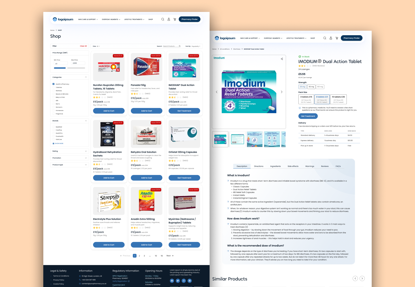
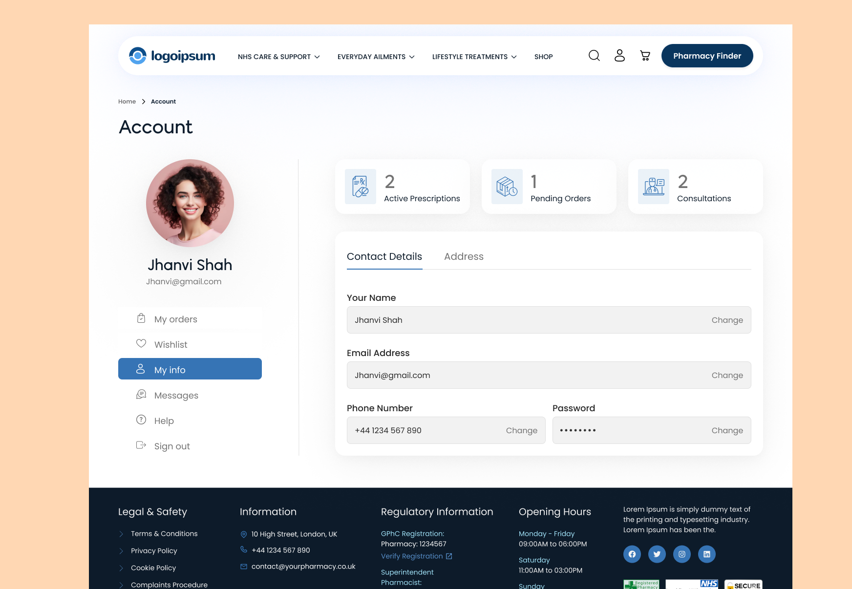
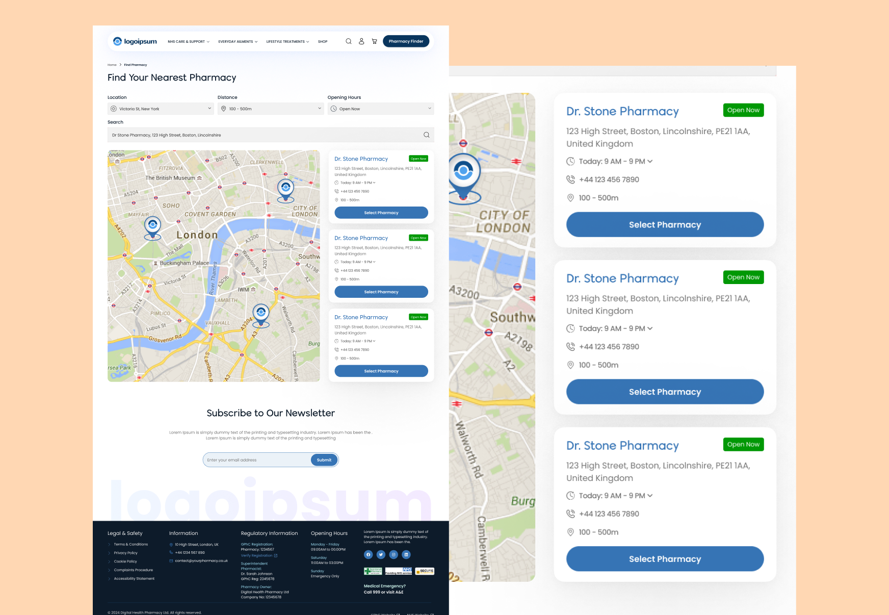
Healthcare design has a lot of competing priorities. Trust, speed, accessibility, and regulatory compliance. These are the calls that shaped how the final design came together.
Most pharmacy sites organise by product type: tablets, creams, sprays. But patients think in symptoms, not formats. Reorganising the nav around conditions like Weight Loss, Asthma, and Birth Control cut the average steps to finding a product significantly during testing.
Trust is everything in online healthcare. The GPhC registration number, the superintendent pharmacist's name, and an NHS partnership badge all sit in the header, not buried in the footer. Patients who saw these details in testing moved through to checkout faster with fewer drop-offs.
A meaningful portion of pharmacy customers are 50 and above. Every text element meets WCAG 2.1 AA contrast ratios, body text sits at 16px minimum, and tap targets on mobile are never smaller than 44px. Accessible design here is not optional, it is the product.
Online pharmacy is a price-sensitive space. Showing the original price crossed out alongside a clear "Save" label on every discounted product removed the hesitation patients felt when comparing costs to a physical chemist on the high street.
Healthcare UX is a different challenge. The stakes are higher, the regulations are tighter, and the users are far more diverse than most digital products. Here is what working in this space taught me.
Portfolio
Selected works that showcase my craft across design and development.
Whether you need a full product from scratch, a design refresh, or a landing page that converts, I bring pixel-perfect craft and strategic thinking to every project.
Email Me