A full UX/UI redesign of the Keells Super mobile app — making grocery shopping simpler, faster, and more enjoyable for everyday Sri Lankan shoppers.
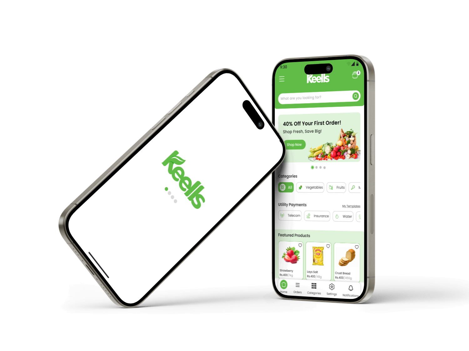
Keells Super is one of Sri Lanka's largest supermarket chains. This project was a concept redesign of their mobile app — rethinking the entire shopping experience from the home screen through to checkout and payment confirmation. The goal was a clean, modern interface that felt fast and trustworthy, reflecting the brand's position as a premium grocery destination.
Everyday Sri Lankan shoppers aged 18 and above who want to order groceries and household essentials from Keells quickly through their phone.
A native mobile app redesign covering the home screen, category browsing, single product page, delivery flow, checkout, and payment success state.
Sole designer from research through to high-fidelity prototype — user research, information architecture, wireframes, visual design, and a component library in Figma.
The existing Keells app felt cluttered and visually dated. Navigation relied on deeply nested menus, product discovery was slow, and the checkout flow had too many unnecessary steps. Users who tried the app for the first time often abandoned their cart before completing a purchase simply because the experience felt more frustrating than walking into a physical store.
I followed a structured five-phase design process: studying user needs and existing pain points, mapping information architecture, creating wireframes, building the high-fidelity UI, and then refining based on feedback before preparing for developer handoff.
The visual direction is fresh and approachable — rooted in Keells' signature green but elevated with generous white space, clear typographic hierarchy, and a bold promotional language that makes deals immediately obvious. The result feels modern and trustworthy without being clinical.
Click any screen to view it full size.
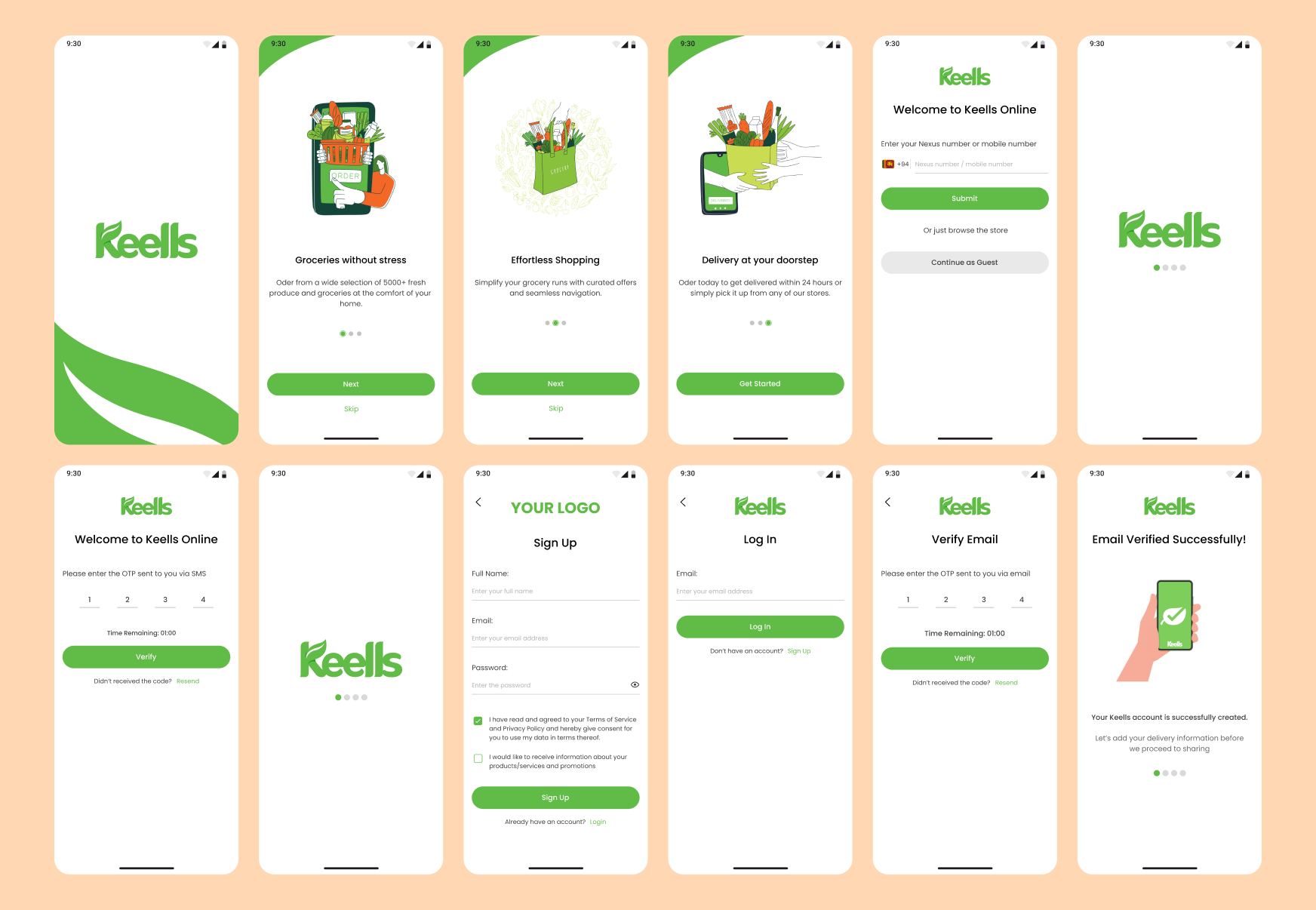
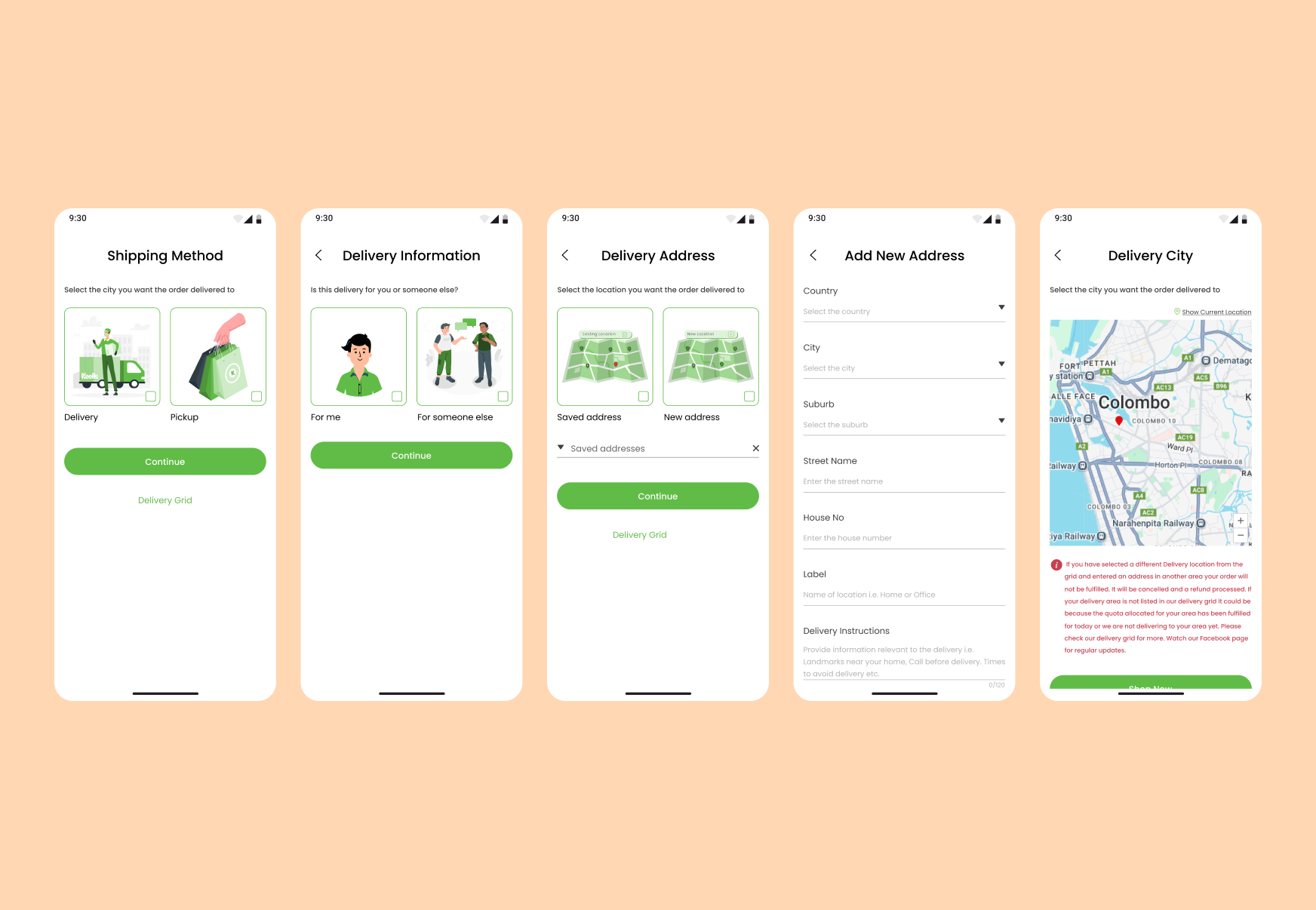
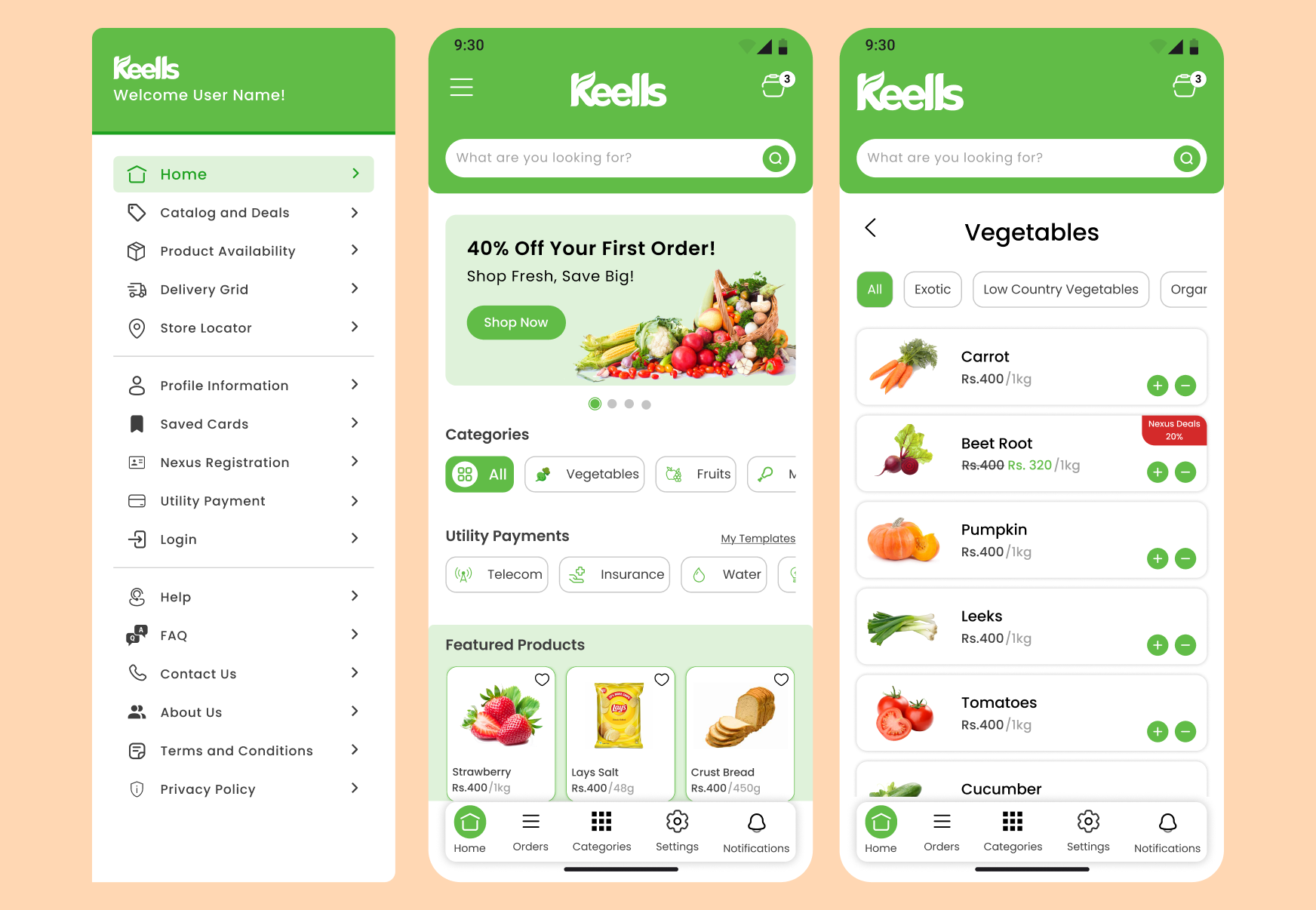
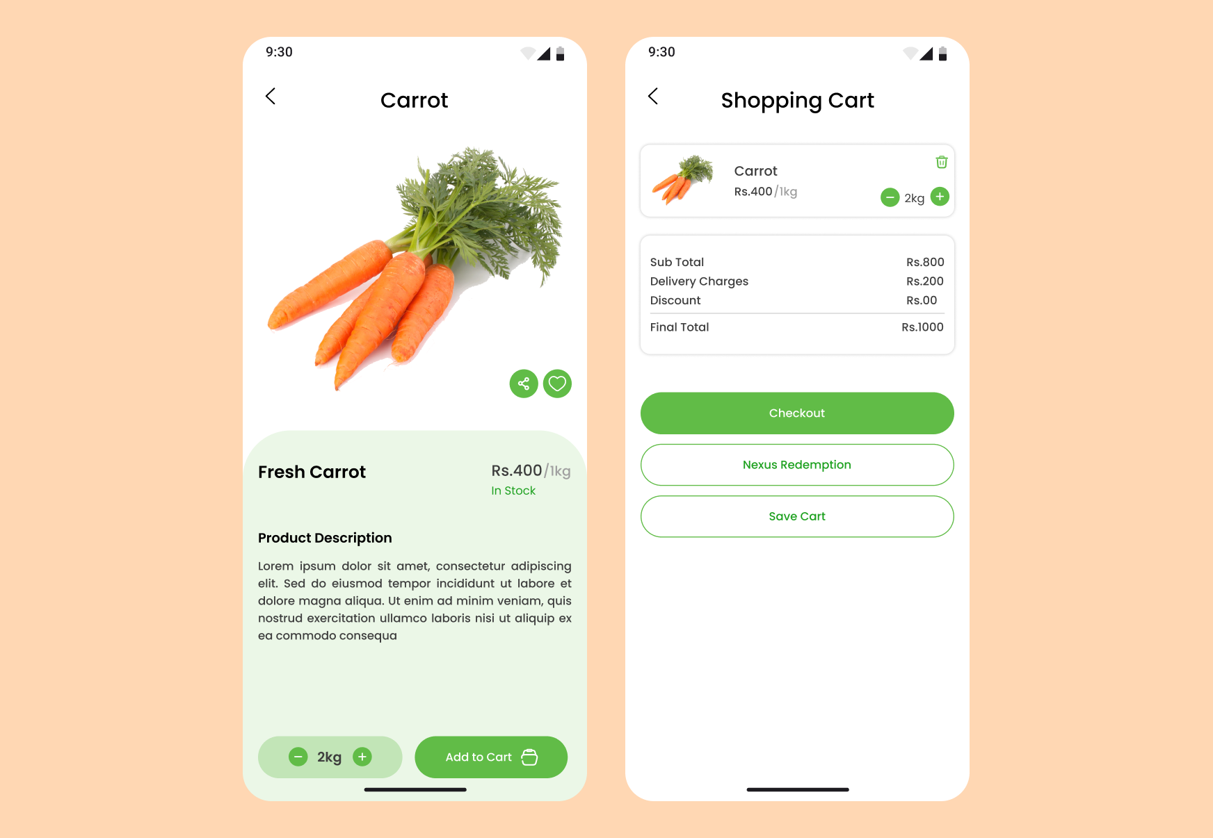
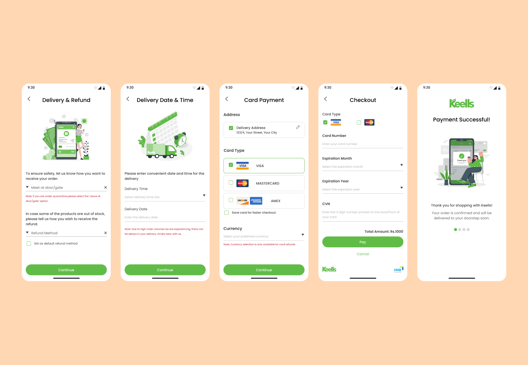
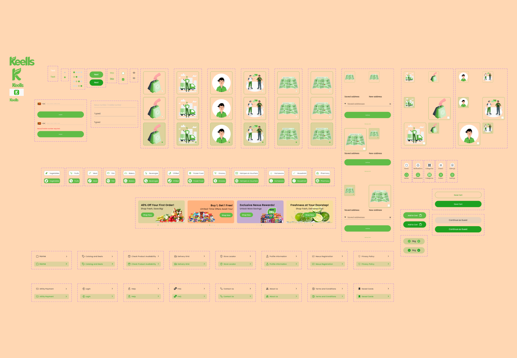
Grocery apps sit at the crossroads of speed, trust, and price sensitivity. Every decision was made to remove friction from the path between landing on the home screen and completing a purchase.
The original app buried categories two or three levels deep. The redesign surfaces the top categories as a persistent horizontal chip strip on the home screen, cutting the average taps to find a product from four down to two in early testing.
Price is the primary reason Sri Lankan shoppers choose one channel over another. Leading with a bold promotional hero card on the home screen creates an immediate sense of value before the user has browsed a single aisle.
Asking "Is this delivery for you or someone else?" at the start of the checkout flow eliminates a late-stage address surprise that caused significant cart abandonment in the original experience.
Every product card shows the product name, weight, and price in a clear three-level hierarchy. Original prices are crossed out alongside the discounted price so savings are immediately scannable — no hunting required.
Redesigning a consumer app for a well-known local brand comes with its own pressures. The brand equity is real — users have strong opinions about what Keells should feel like — and the design has to honour that while still pushing the experience forward.
Portfolio
Selected works that showcase my craft across design and development.
Whether you need a full product from scratch, a design refresh, or a landing page that converts — I bring pixel-perfect craft and strategic thinking to every project.
Email Me